

What The Heck Is A Heat Map–And Why Do I Need It?
Setting up your business website is just the first step in creating a successful business. You also need to know how well your website is working and, more specifically, what things are performing better than others to draw in customers.
One lesser-known but effective way to do this is with a heat map.
How It Works
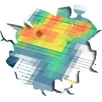
A heat map uses colors to represent what’s being measured. In medicine, you’ll often see heat maps used to assess brain activity or other physical functions. Red generally represents a great deal of action and blue the least amount, with lots of variations in between.
It works the same way for a website except that colors, not numbers, are used to represent activity such as clicks and views. With just a glance you can see where people are clicking most and least on your website and can then make the right adjustments to optimize your site.
For example, with a heat map you can easily see that clicks on your “Free Trial” link have gone from red to blue in the last month. As a result, you might want to change the link’s design, location or wording to try and improve the click rate.
Creating A Heat Map
Crazy Egg, Click Heats, and Clicktale are some sites where you can learn more about heat maps. If you’re familiar with coding, you can check out this website for a tutorial on creating your own heat map.
However, your first best option would be to check with your web designer to see if they offer this service or get their recommendation on where to get one created.
For many people (myself included), deciphering lots of numbers is neither easy nor enjoyable, which makes us avoid the important task of evaluating and re-working our website when required. A heat map is a great way to understand and track the effectiveness of your website to help it create the best results for your business.